
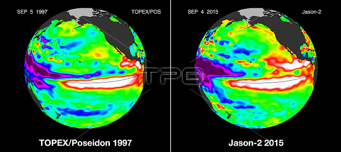
El Nino comparison. Maps comparing Pacific Ocean heights on 5th September 1997 (left) and 4th September 2015. Blue and purple areas are lower than average and red and yellow areas are higher than average. Water expands as it warms and so warm areas of the ocean are higher than cool areas. The red areas across each centre are indicative of El Nino events. El Nino effects weather systems across the world, causing drier conditions in Australia and South-East Asia, and wetter and warmer conditions in the Americas, with often dire effects for agriculture. 1997 saw one of the most powerful El Nino events of the 20th century. 2015 could see an even more powerful El Nino event, possibly the most powerful since 1950. 1997 data obtained by the TOPEX/Poseidon satellite, 2015 data obtained by the Ocean Surface Topography Mission (OSTM)/Jason-2 satellite.
| px | px | dpi | = | cm | x | cm | = | MB |
Details
Creative#:
TOP15939493
Source:
達志影像
Authorization Type:
RM
Release Information:
須由TPG 完整授權
Model Release:
No
Property Release:
No
Right to Privacy:
No
Same folder images:
 Loading