
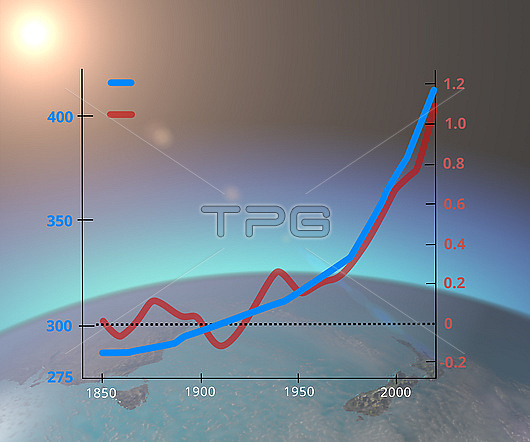
Graph showing atmospheric carbon dioxide (CO2) levels in parts per million (ppm, blue line) and the increase in average global annual temperature compared to 1859 in degrees Celsius (C, red line) from 1850 to around 2020. Since the Industrial Revolution levels of carbon dioxide, a greenhouse gas, have risen due to the combustion of fossil fuels and deforestation. This has lead to an increase in average global temperatures. For a labelled version of this image see C057/3742.
| px | px | dpi | = | cm | x | cm | = | MB |
Details
Creative#:
TOP28875940
Source:
達志影像
Authorization Type:
RM
Release Information:
須由TPG 完整授權
Model Release:
n/a
Property Release:
n/a
Right to Privacy:
No
Same folder images:
1800s1900s19thcentury2000s20thcentury21stcenturyannualartworkatmosphereatmosphericaveragecarbondioxidecelsiuschartclimatechangeclimatologicalclimatologyco2earthscienceenvironmentenvironmentalsciencegasgeographicalgeographyglobalglobalwarminggraphgraphicgreenhousegasillustrationincreaseincreasingno-onenobodyrisingschoolsciencescienceeducationtemperature
1800s1900s19th2000s20th21stannualartworkatmosphereatmosphericaveragecarboncelsiuscenturycenturycenturychangechartclimateclimatologicalclimatologyco2dioxideeartheducationenvironmentenvironmentalgasgasgeographicalgeographyglobalglobalgraphgraphicgreenhouseillustrationincreaseincreasingno-onenobodyrisingschoolsciencesciencesciencesciencetemperaturewarming
 Loading